To plot a data file, select it from the NDE Data panel and press either the X-Y Plot button (looks like a line chart) or the Image Plot button, depending on whether you want to plot a simple line chart or an image plot. After reading the data NDIToolbox will open a new window with the plot. You can also add/edit plot and axis titles and toggle the grid; image plots additionally allow choosing different color scales and applying labels to the colorbar.


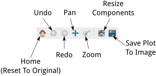
To pan around the plot press the Pan button in the tool palette at the bottom of the plot window, and drag the plot with the left mouse button. You can also zoom in/out in horizontal and vertical scale by dragging with the right mouse button. To zoom in to a particular region, press the Zoom button and select a region in the plot. To reset the plot to its original bounds, press the Home button.
Exporting Plots
If you’d like to export the plot as a static image, press the Save button and choose a destination filename. NDIToolbox currently supports the following formats for exporting plots:
- Encapsulated Postscript (EPS)
- Enhanced Metafile (EMF)
- JPEG
- Portable Network Graphics (PNG)
- Postscript (PS)
- Raw RGBA Bitmap (RAW/RGBA)
- Scalable Vector Graphics (SVG/SVGZ)
- Tagged Image File Format (TIFF)
For general distribution a bitmap format such as PNG or JPEG can be used, however if you require higher-quality presentations (e.g., for publication) consider a vector format such as EPS or SVG.
You can also save the data as an HDF5 file by choosing Save Current Data from the File menu.
Plots have various operations such as rectification, window functions, etc., depending on what type of plot is shown. NDIToolbox also supports plugins that can alter the data in a plot. To get back to the original dataset after running any of these operations, choose Revert To Original from the plot window’s Operations menu. This will discard all the changes you’ve made to the data, and replot the original dataset. You can also save a modified dataset by selecting Save Current Data from the plot window’s File menu.
Colormaps
As mentioned above, image plots (and Megaplots, see below) support the use of different color scales (“colormaps”) to aid in making the most of the presentation of your data. NDIToolbox’s plotting library includes 138 colormaps, but also supports creating your own customized colormaps. To create a new colormap, select the Create Colormap… menu item from the Colormaps submenu in the Plot menu in an image plot or Megaplot presentation. The Create Colormap window shown below will open. Colormaps are created and edited using the controls on the left side of this window; a preview of the current colormap is shown in the image plot on the right. A sample three-color colormap (black, gray, white) is loaded to get you started; you can add/delete/reorder these colors or load your own colormap (more detail below).
A colormap consists of a list of one or more colors defined by their Red, Green, and Blue components and a type. Two types of colormap are supported. A linear gradient colormap linearly interpolates colors between the colors defined in the colormap to create a smooth gradient of 256 colors. A straight list colormap does not interpolate colors and creates a simple list of the colors defined in the colormap.
The following screen shot illustrates the difference between the two types of colormap: on the left, a dataset is shown using the ‘cool_blue’ colormap that ships with NDIToolbox as a linear gradient. On the right, the same colormap as a simple list. Both colormaps use the same four colors, but the colormap on the left creates gradients between the four defined colors to generate a final colormap with 256 colors. The colormap on the right uses only the four colors defined in the colormap itself.
Most data presentation applications use a linear gradient colormap, however for edge detection and similar “go/no-go” use cases you may find a simple list colormap more useful.
Colors in a colormap are defined as a triplet of 3 numbers that set their Red, Green, and Blue components respectively; and are expressed as a decimal between 0 and 1. The color black is thus defined as 0,0,0; white is 1,1,1; and all other colors are in between these ranges.
To add a new color, click the New Itembutton in the Colors list and the standard color dialog for your operating system will be displayed. Modify the color as desired and click OK; the color’s components are added to the colormap. Colors are listed in the colormap from low end of scale to high so that the first color in the list is used to represent the smallest values in the data. To reorder the colors, select a color in the list and press the up or down arrow buttons in the color list to move it up or down in the colormap respectively. To delete a color, select the color and press the delete button in the color list.
To preview the current colormap, press the Preview Colormap button at the top of the Preview pane. The sample data are replotted using your current colormap. Once you’re satisfied with your colormap you can save it for future use by selecting the Save Colormap… item from the File menu. By default NDIToolbox will store the colormap in its colormaps folder but you can select any location (note that NDIToolbox will only look in the default folder for colormaps to use, however). Colormaps are saved as ASCII text in JSON and can be edited with a conventional text editor if desired. The filename you choose for the new colormap is used to name the colormap for subsequent plots; as a result you’ll likely want to use filenames like “cool blue”, “Modified_Spectral,” etc. NDIToolbox copies several sample colormaps to your colormaps folder on its first run, we recommend having a look at them to get you started.
Once you’ve saved your colormap to your colormaps folder, NDIToolbox will now include it in the list of available colormaps. To use your colormap in a plot, select it from the list presented when you select the Select Colormap… menu item from the Colormaps submenu under the Plot menu.
Megaplot
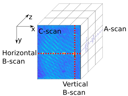
NDIToolbox also has a “MegaPlot” that plots three-dimensional data directly using a common presentation style for NDE data shown below.
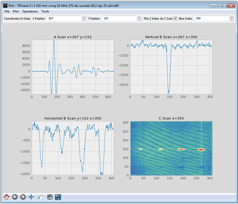
In this type of plot, a C-scan plot in the lower-right indicates your position in the Z Axis in the 3D data. To zoom and pan in each plot, make sure the Use Plot Navigation Tools checkbox at the bottom of the screen is checked to enable the tool palette. When this checkbox is unchecked, the tool palette is disabled and the Megaplot presentation responds to clicks inside the plot. For example, when you click on a position (x0, y0) inside the C-scan, the plot will update the other three panels:
- The A-scan (upper-left) is a plot of the data through Z at position (x=x0, y=y0).
- The Vertical B-scan (upper-right) is a vertical slice of the current C-scan plot (x=x0, y), or a 2D slice of the data at (x=x0).
- The Horizontal B-scan (lower-left) is a horizontal slice of the current C-scan plot (x, y=y0), or a 2D slice of the data at (y=y0).
By default the Megaplot uses 1D linear slices through the current Cscan for displaying horizontal and vertical B-scans. To use the more conventional 2D planar slices for B-scans, check the Plot Conventional B-scans item from the Plot menu. NDIToolbox will now plot standard 2D B-scans in Megaplot presentations until you uncheck this menu item.
Frequently in ultrasonics NDE you’d like to define a subset of the 3D data to generate a C-scan rather than simply taking a slice in Z. From the Operations menu, choose the Define C Scan menu item. You’ll be asked to specify the range over which you’ll be generating the C-scan, e.g. if you specify 222-444 the C-scan data will be generated using the subset of data between Z=222 and Z=444. Next, you choose the function used to generate the C-scan. Several options are available including min, max, and average. Choose the function and click Ok, and the C-scan data will now be the results of applying this function against the specified subset of data. For example, the following screenshot shows the results of applying the min function against Z=222:444 in the ultrasonic immersion tank data shown above in the MegaPlot screenshot.
Notice that when you generate a C-scan plot in this fashion that the linear B-scan plots are now taking data from this C-scan and not the original data. The A-scan continues to take data from the original data set, as will conventional B-scans.
One thing to note about MegaPlots is that although your data is presented in one or two dimensions, the underlying 3D data is unchanged. Plugins that don’t expect a 3D data set can behave strangely or run slowly. If you need to use a plugin and you’re not sure if it supports 3D data, consider plotting a slice of the 3D data instead of using the MegaPlot and running your plugin against this plot.
Although the MegaPlot offers one way to present 3D data by showing A, B, and C scans simultaneously, you can generate each of these plots by itself in its own window. To produce a B-scan plot from a 3D dataset for example, choose the Image Plot function in NDIToolbox and as usual with 3D data, specify a plane. Going back to the immersion tank ultrasonic data shown in the MegaPlot figure, the following screenshot shows two B-scans taken from this data by slicing in the X and Y axes.
Similarly, if you’d like to generate an A-scan of a 3D data set, choose the X-Y Plot function. You’ll be asked to specify a slice similar to the slicing done for image plots, but in this case you specify two indices. A typical A-scan representation in NDIToolbox is performed by specifying a point in X and Y and plotting the Z values at that point, as shown in the following A-scan plot taken from the immersion tank scan data at position P(267, 152).
